Income Support application management
COMPASS project — Intake management
Ministry of Community and Social Services, Government of Alberta
October 2021 – Present (on-going)
User Experience Design • Public Service Design • Internal Application
Problem
The COMPASS project is a digital modernization of the Income Supports services for Albertans looking for assistance towards essential living costs.
After applying and meeting eligibility criteria, citizens work with government caseworkers to help build action plans and receive assistance. There was a combination of telephone and in-person application process and this project’s intent was transition towards online application and digital management of the files—accelerated due to the COVID-19 pandemic.
Internal Ministry staff quickly built an MVP in Sharepoint to manage applications intake, assignment, and on-going case management. The capacity to effectively manage and assign cases quickly reached the limitations of what Sharepoint could offer.
There was also a desire to align the seven provincial regions into a “Standard of Service” model, rather than each area having nuanced and disparate processes.
Approach
Users & Audience
- Ministry staff who manage applications intake
- Case workers who work with Albertans
- Supervisors and managers
- Ultimately, a more consistent, efficient, better experience for staff will translate to a better experience for citizens
Role & Team
- My role: User Experience designer, User Interface designer, User researcher
- Product team also consisted of: 3 Full-stack developers, a QA / Automation specialist, and a Product owner
- Other resources: 2 Subject matter experts and co-product owners, a Data architect, a Service designer, and a Scrum master (shared between multiple teams)
Scope & Constraints
- How can we ensure that required data is captured and processed to be transferred for on-going care with a case management worker?
- All applications must go to a provincial queue
- Applications get randomly distributed amongst seven provincial regions (via a weighted ratio based on population)
- Regional assignors assign cases to regional caseworkers (based on capacity and caseloads)
- Emergency cases (domestic violence, evictions, utilities cut-off) must resolved within 2 business days
- Cases can be re-assigned to other regions
Challenges
- Seven service regions, each with their own macro and micro processes
- Emergency cases must be re-assigned to home region (client’s region of origin)
- Cases can be re-assessed. This re-assessment must be returned to the original case worker, but this work was not being captured as part of their workload
- Needed to connect and integrate with legacy systems and databases
- Sharepoint MVP was limited in capability and functionality
- User task flows were implicit and not documented
- Training was not standard and varied between both individual workers and regions
- Larger population centres had a pool of caseworkers assigned to a pool of clients, instead of dedicated assignees to dedicated caseworkers
- Complex and out of date policy and eligibility criteria, which added ambiguity and confusion for workers to carry out duties
- Delivery date for Beta Release was moved up 4 months
- MVP did not go through any rounds of usability testing or validation before release
Process
Methods of research
- User interviews
- Comparative research
- Contextual inquiry (job shadowing)
- Co-design workshops
- Affinity mapping
- Usability testing
Artefacts and activities
- User / task flows
- Features prioritisation
- Card sorts
- Wireframes
- UI flows
- Mock-ups
- Prototypes
- Research synthesis and reports
I joined the project 9 months after the kick-off. The first activity was an MVP post-launch retrospective with a cross-section of users (call centre staff, caseworkers, supervisors, and managers).
We conducted two remote 2-hour sessions which included a “Rose, Thorn, and Bud” exercise—What went well? What was, or continues to be, a pain-point? What opportunities might exist to improve the service? After collecting feed back we ran multiple affinity mapping and dot voting exercises to refine the results and re-framed them as divergent-thought questions. At the end of both sessions, we had 12 areas for further exploration by the product team.
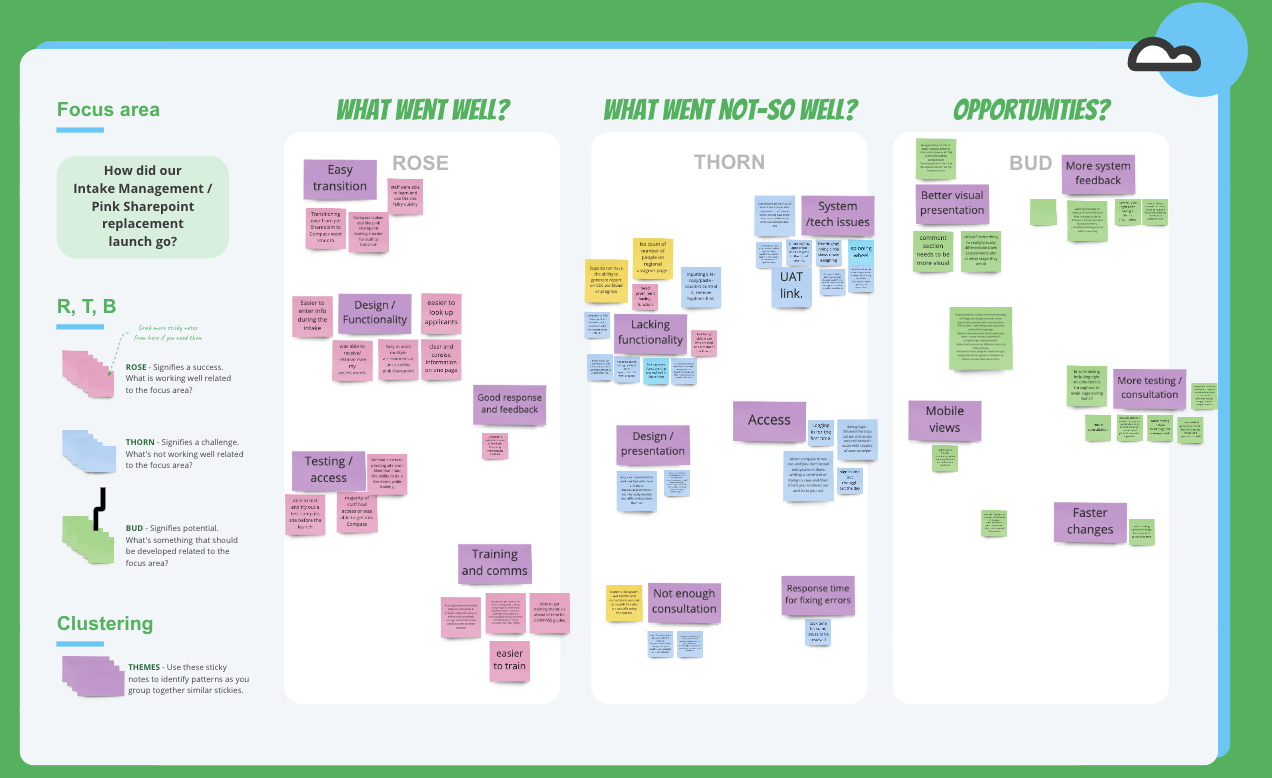
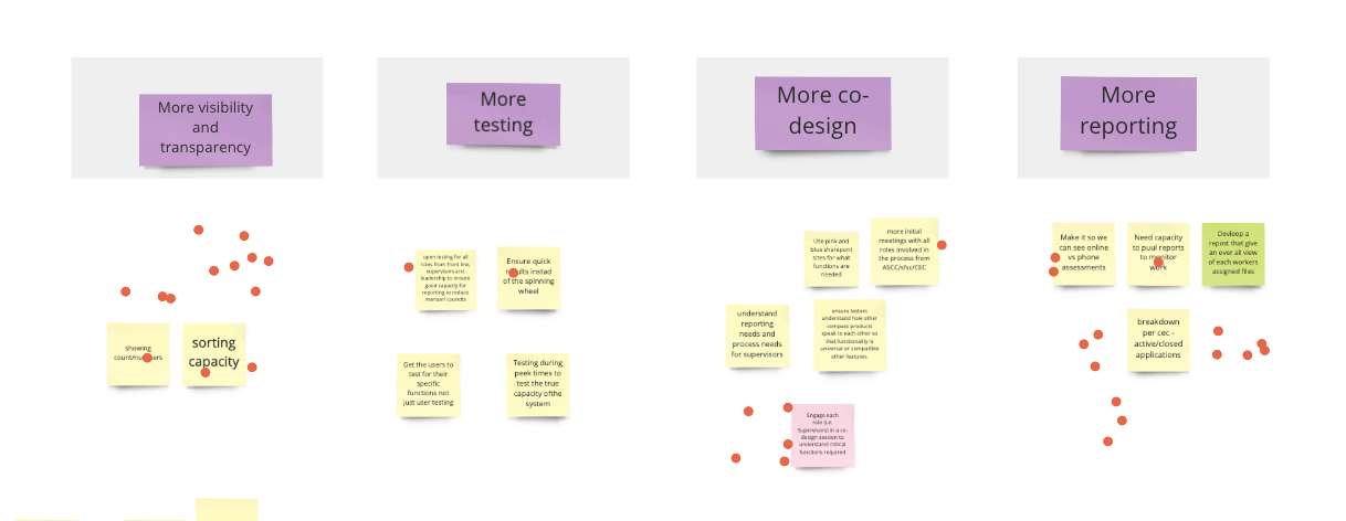
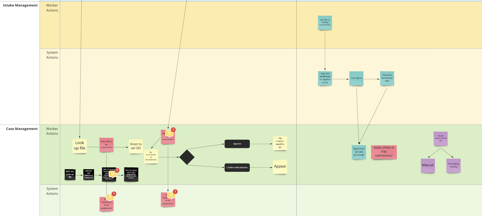
The product team ranked the areas for technical difficulty vs value-added in a prioritization exercise, in order to add action items to the backlog. We also re-visited and revised user task flows.
We also conducted a round of contextual inquiry and job-shadowed a small group of call centre and intake workers to see how they were using the MVP and where they continued to have pain-points.
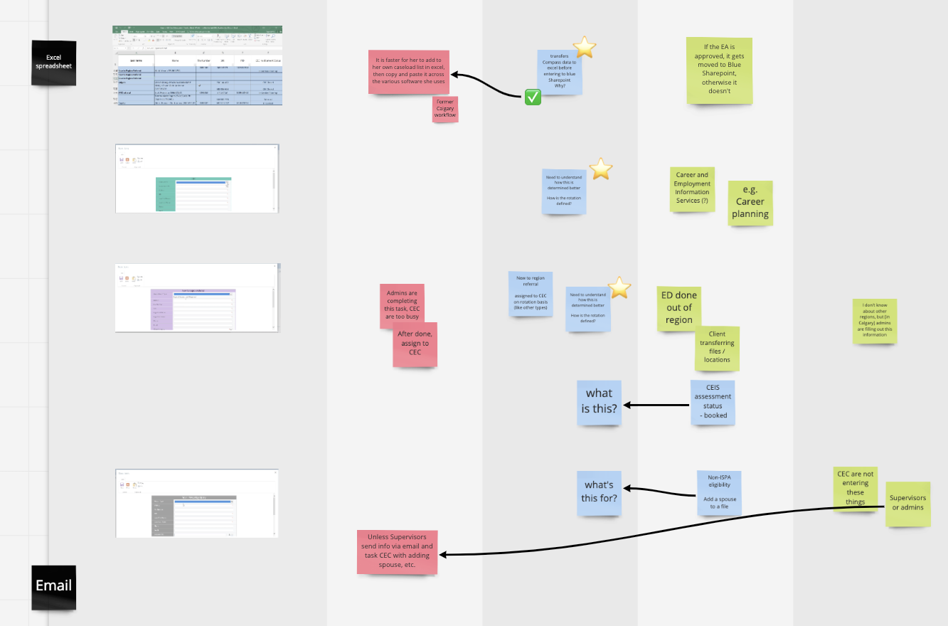
We then moved from lo-fi wireframes to hi-fi wireframes, validating and confirming decisions with the business and stakeholders throughout. Once we had validation, we proceeded to mock-ups and prototyping, which were created in alignment with the Digital Innovation Office’s Design System.
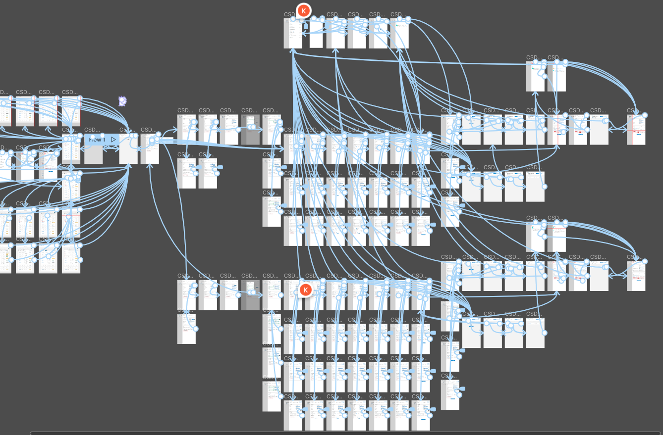
We then took our hi-fidelity prototypes and ran a round of usability testing with our target users: the front-line call centre and intake staff. Due to the limitations of the prototype (not fully functional software), we had specific tasks we asked workers to achieve and finished with an open round of impression testing and a co-design session with each tester.
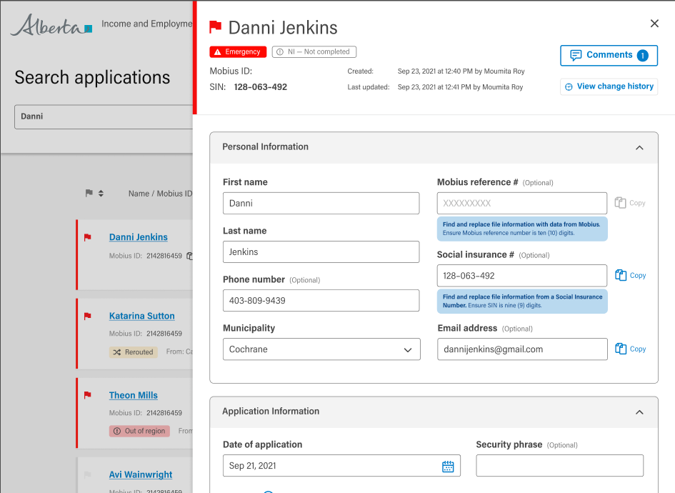
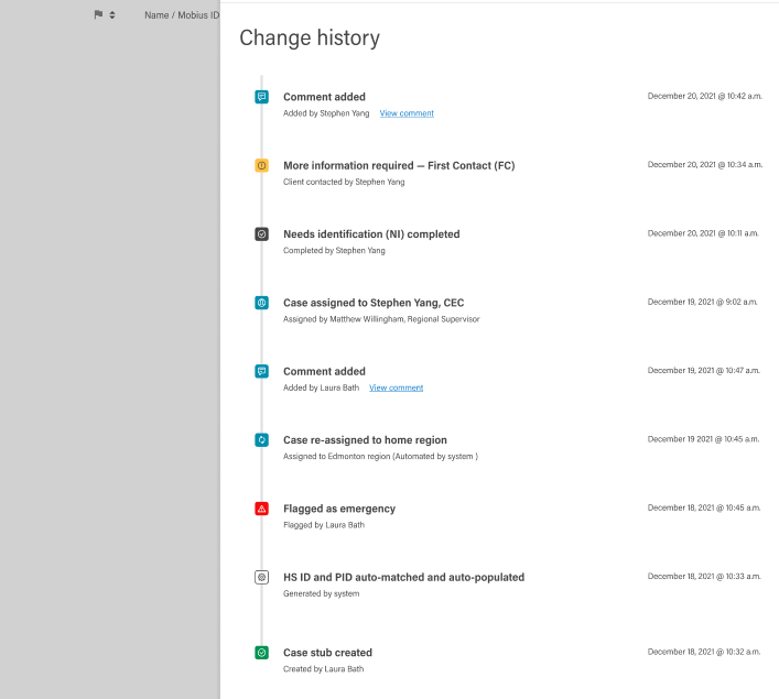
These rounds of 2-week design sprints of validation, creation, testing, and revisions continued until the Beta release of the revised product in May 2022.
Research Findings & Impact
Some of the more salient research findings and how they impacted the project direction were:
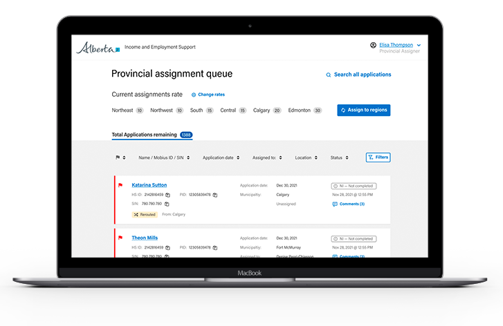
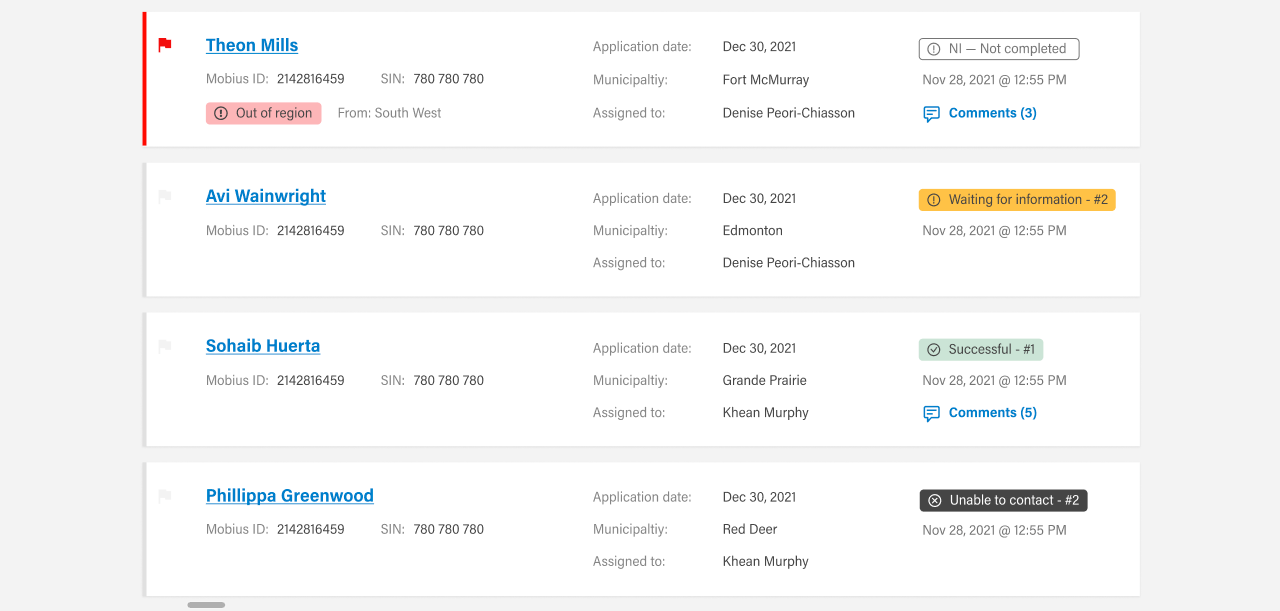
- The system did not have enough “at-a-glance” information for staff to gauge effort and status of applications. This shifted the previous tabular data presentation to a more dynamic and interactive card interface.
Before (initial MVP)

After (after feedback in co-design and user testing)
- The users and stakeholders wanted more consultation and co-design. We built a cadence where for the duration of the project we either did a co-design or usability testing session at least twice monthly.
- There was an increased desire for more abilities for users to search, sort, and function, so we added more advanced functions for users. During usability exactly 0 users used any of those features. They searched for a SIN number to see if a client was in the database, and if not, they create a new file.
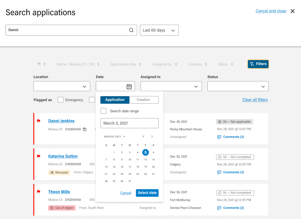
- Users were asking for pagination and row numbers in the tables because they were used to manually counting files in Sharepoint for their reports. We spent some time determining what other data they needed to see and ended up adding a small counter for these metrics. They were overjoyed. They didn’t know that was possible.

Results
Outcomes
- Ministry staff overjoyed with level of engagement. They felt seen, heard and understood. There was a lot of excitement for continued participation and higher engagement levels
- Usability testing overwhelmingly positive and the changes borne from co-design workshop were reflected with a fast turn-around time
- User error and confusion were reduced
- Launched on June 8th, so real-world results expected soon!
- Press releases:
- Making it easy for Albertans to apply for support – alberta.ca
- Government announces rollout of online applications for Alberta income supports – Edmonton Journal
- Making it easier for Albertans to apply for benefits – June 8, 2022 (YouTube)
- Nice shout out from the Honourable Minister to my previous project the Find Housing Digital Service as another example of good work 🙂
Reflections
- Early portions of the project moved too fast and broke too many things. More time to document desired process and outcomes, and compare to current process and outcomes to standardize should have been done.
- Not enough documentation and research, with too heavy of a push to delivery. The entire scope and constraints weren’t fully understood, and multiple revisions and “Shoe-horned” functionality before iterative releases was common
- The decision to start usability testing during wireframes and mock-ups saved a lot of time and surfaced blind spots and issues that required deeper dives (and sometimes policy change decisions). This saved a lot of time and effort further down the development pipeline. Some functionality was missing and there was some “narration”, but the overall interaction patterns were able to be validated very quickly
- Testing early with mock-ups allowed us to prevent more expensive consequences of being too responsive to perceived need, especially user demand for “cool” features that went unused
- Sometimes users ask for things, because they don’t know what’s possible